Mike’s Toon Shader
What it can do, how to use it. A work-in-progress.
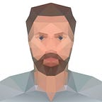
Style Examples
Features
The basic concept is the shader “paints” the surfaces with the dark/light hatching, and then the real lights in the scene light the surface up. But instead of the lights revealing the curvature of the surface like they would if it was a figurine under a lamp, the surface ignores the angle of the light and lights flatly. This lets you set the overall brightness and tint of your colors with your light, including creating flat gradients across the surface using lights with falloff.
Light vs Dark texture swap. There is a separate texture+tint for the “bright” area vs the “dark” area. This allows full control over color, better than a single tint for everything. Eg shadowed skin tones might be light and reddish while shadowed cloth is pure black. Or you might want a Hellboy effect with some full-brightness linework & specks in the otherwise black shadowed areas.

Note that the shader defaults to a black tint for dark, so adding a Dark Texture won’t seem to do anything until you change the Dark Texture Tint to white or other color.
Texture Swap Angle / Halftoning Pattern + Spread. The Angle to the light that the texture swaps between light and dark. Confusingly there’s a “base” angle and “dynamic” angle — the virtual light system sets the Dynamic Angle by adding to the Base Angle, so the virtual light can be tuned to push the shading more/less around all the materials at once (a brighter/dimmer shading effect). The Base Angle allows different materials to react differently: lighter/translucent/glowing materials might call for smaller shadow areas than heavier materials.

The halftoning pattern thresholds a grayscale image to create a graphic pattern of bright vs dark hatching over the Spread angle, instead of a soft fade from light to dark.

This is much more of a comic book look than animation look, but the spread can but turned to zero for a hard line, or use the 3-tone shader instead that does a soft fade instead of halftoning. (It also adds an optional “highlights” layer with its own virtual light source)

Rimlight with zero brightness still removes any dark areas to “reveal the bright” version of the material. The color of the rimlight is added to that base. But there’s a checkbox for “Rimlight Replaces Color” where the rimlight will be its pure color instead for a more illustrated look.

Note: in “replace color” mode it won’t add rimlight where the base texture has black painted into it: it considers black painted lines to be “ink” that can’t pick up light.
Note: the rimlight system should be updated to the 3-Tone shader’s system that has more explicit control over how rimlight color behaves and the ink threshold.
The Rimlight has a setting for “Reach” and “Fresnel”. Reach is how far around the model the rimlight wraps, and Fresnel masks away the parts of the surface facing the camera (ie limits the rimlight to the rim)

Outlines are a rendering pass and so can’t be turned off with a checkbox — you need to comment out the code in the shader. They’re made by inverting the mesh and pushing the vertices outward.
“Screenspace Outlines” pushes the verts outward only in the camera plane. Turned off they’re pushed along the normal in full 3D space. Either way can look better depending on how the geometry might intersect other geometry.
“Thickness in Screenspace” makes the line thickness shrink as it gets closer to camera, so near geometry appears to be outlined with the same thickness pen as distant geometry. As you turn this up you’ll probably have to increase the base thickness to get back up to desired thickness. With it turned all the way down the linework shrinks as the character moves away, like the character is a cel/sprite that’s being scaled.
Everything else should be self-explanatory. (Noise, Specular, etc)
Instructions
1. Setting Up The Project
Before choosing colors for your materials, you’ll want the scene and project set up to give you maximum control and predictability.
Ambient Light
You probably want to turn ambient light off in the scene. This way you’re building up from black, rather than having a base color under everything. This is especially important if you want dynamic black shadows from real lights to match black hatching. (Ambience brightens the shadows)

You could also set the ambient light to white to get your pure toon colors without any lights at all (Great for performance!) But because the shading responds flatly to lights anyway, a single white directional light pointing in any direction will give the same effect and make things a lot easier to adjust than going into the Lighting Settings menu.
The only reason to tie your directional light’s direction to the virtual light’s direction is to make the dynamic shadow direction match.
Another option is using the Ambient Gradient setting to add a little extra light from above and/or below that will create a little gradient shading over the geometry with no performance cost. Using a point light with falloff to create a gradient is usually a better effect though: the shader ignores surface angles so the gradient is just based on distance from the light, giving a flatter illustrated look.

Linear Color Space
Linear color space will make the colors and lighting act more predictably. Unity defaults to Gamma space because older mobile platforms don’t support Linear.

Why Linear? In Gamma space, the HDR color wheel doesn’t work: if you pick a color to match (eg the skin tone), it samples a gamma-corrected color but then the color is applied without gamma, coming out dark:

The HDR option is only there to allow a texture to be tinted brighter than 100% when tuning a material. So you have 2 options:
1. Use Linear Space
2. Use Gamma Space and delete the [HDR] flags in the shader code

Texture Import Settings (for Linear Color Space)
In Linear Space, textures are still imported with gamma correction by default, AKA they were authored in “sRGB”. This is good. You want the colors to look the same as they did in Photoshop and all your image viewers.

Textures that are used for effects — where you want a value of 128 (out of 256) to mean 50% — you have to uncheck sRGB so the texture is treated linearly. So if you create any new halftone textures, match that setting or you’ll get a weird bias in the halftoning.
If in Gamma space, the setting does nothing: all textures are treated as if the built-in gamma is linear.

2. VIRTUAL LIGHTS
Virtual Lights are just locations in space (an empty GameObject with a VirtualLight component) so the shader can know what direction the shading and rimlight are coming from.
A component called “Update Shaders” lets you connect Virtual Lights into its various slots and then has a list of materials that it sets the shader parameters on. The “Update Shaders” component makes it easy to maintain the list of materials: just link whatever objects you want into the “Objs With Mats” array at the bottom, then click “Fetch Mats From Objs”.

It will search the entire hierarchy of each item in the list for any Toon Shaders and the “Mats To Change” array will be replaced with that complete list. You’ll immediately see the lighting update on any new materials found.

Any amount of characters containing any amount of materials is supported:

Now the Key light and Rim light will be shared with all the materials in the list. You can move the virtual lights around and see what happens to the shading. Virtual Lights also have settings that you can adjust, for example the “swap bias” of the key light (allowing it to push its way around the surfaces more or less) and the Reach/Fresnel/Color of the rimlight.
Note that some of the sliders and color boxes in the materials will no longer respond to manual adjustment as this script is now overriding them.
UpdateShaders uses a single point in space as the “target” that the virtual light angles are measured against, called “Light Angle Sample Point”. If you have two characters on opposite sides of a light, you’ll want each to have their own UpdateShaders script so the light angle can be different for each one.
Note that characters shouldn’t share toon materials if you intend to light them differently: if a material is in more than one active UpdateShaders script, it’ll end up with whichever setting was applied last, shared across all objects that use it.
You can link the Sample Point to a joint on the character so if you move the character relative to the lights the lighting updates as you’d expect. I recommend using an empty GameObject parented to the character so you can finetune each shot by moving it to the ideal spot. If you link it to nothing, it defaults to the object the UpdateShaders component is on. You could parent that to the character so everything is in one place, but if you’re swapping rigs on and off you’ll want them separated.
3. WORKFLOW
Changing light rigs: You can put all the virtual lights and UpdateShader objects into a hierarchy, and toggle the whole thing off while toggling another on. This way you can swap lighting setups within a single scene with a single set of characters. Eg if you want to make a cinematic (eg using Timeline to sequence a series of shots) you can light each shot independently by activating one light rig at a time in the Timeline. This is a much better workflow than keying the positions and other values on a single light rig.
4. AUTHORING CHARACTERS
Characters should be authored with toon shading in mind. This would mean:
- Mesh/Material separation
Different mesh or material assignment for any pieces of geometry that you want different shading styles on. This probably means different materials for different real-world materials. Examples of things you might want different on different materials:
- Halftoning Pattern
eg parallel lines on skin, crosshatching on denim, stippling on sand…
- Halftoning SCALE
halftoning is tiled across the UV space, so if large areas of the mesh have small areas of the UV space, those areas will get enlarged halftoning patterns compared to the other areas. Any particular mesh should have the UV space laid out with the halftoning pattern in mind. UNLESS you’re using Screenspace Halftoning, where the screen itself becomes UV space.
- Halftoning Note: a custom halftoning pattern can be painted onto the character’s entire UV layout as a single untiled texture if you want specific line directions or different patterns/scales in specific places. This is a pretty tedious task though (have to paint several “layers” of shading from light to dark over the entire character), and the resolution requirements to retain the fine details of the hatching pattern may be prohibitive. This and custom normals to create “shading planes” with clean lines is required for a look that better mimics hand drawing — especially on faces — but it’s difficult so most people will just tile a pattern across the entire UV space.
- Halftoning Angle/Spread
eg lighting on skin might reach further around as if there’s subsurface scattering, but blacks might be heavier on heavier materials. Hair might have a really broad hatching area to transition from light to dark where metals might have a very hard cutoff.
- Outline Weight and Color
eg some meshes might want thicker outlines than others. Some art styles have different outline colors for different materials.
- Specular Highlights
eg sharp white highlights on eyeballs, skin might have broad soft highlights in some styles, no highlights on denim
- Shader Note: for better performance, any of the above could be controlled with texture masks or vertex colors instead of requiring unique meshes/materials (and therefore draw calls). But because there are too many possible permutations to cover, a new shader should be built to meet the needs of your particular art style and art pipeline using this Uber shader as the blueprint. Delete the sections you don’t need and add multipliers and inputs for the features you want to control via texture or vertex color channels. - Textures
- If you want different colors within a single mesh+material, textures would usually have flat areas of solid colors, although painted-in-highlights work well in some styles. Normal textures made for conventional shading will probably look bad.
- “Inner Lines” often need to be painted in to create permanent linework details that are too subtle in the geometry to appear as outlines. Eg if a character always wrinkles/dimples/nostrils, or lines around collarbones or muscles, etc. But for line work that stays sharp up close, the lines should actually be modelled as geometry rather than just painted into a texture.
- Light vs Dark textures are supported: the dark areas don’t have to be black. They can be a separate set of colors. This can allow Anime/Disney “sharp/soft 2-tone shadows” style or Hellboy’s “the dark areas retain some inverted-color details” style. - Geometry
No hard edges on the mesh. It breaks the outlines. Hard edges double up those verts anyway, so for the same geometry budget you may as well make a thin line of polygons across the transition.
Another option is to model the outline mesh as its own inside-out mesh, granting ultimate control of line thickness. Then you can give it its own material+shader (unlit or even diffuse with color texture?) and remove the outline pass from the toon shader. - Transparency
Transparency is a problem. Transparency is always a problem in realtime rendering, more so when you’re trying to draw outlines. There’s a Toon Cutout shader variant that can do a good job (without outlines), but depending on how fine the details are modelling the cutouts would almost certainly be better.
There’s also a variant for partial transparency, but depth sorting will probably be a problem. For effects like a glass helmet you’ll probably need to customize the shader to make rimlight opaque or otherwise create the specific effect you’re after.
5. CONVERTING EXISTING MODELS
Existing models will probably fail to meet some of the above criteria, but can usually be doctored into something pretty good without needing to edit the character’s geometry or UVs in a modelling package. Textures, however, are a different story.
Normal Maps are supported, but PBR maps (specular, metalness, smoothness, etc) have no function.
There is a huge variety of ways characters are built, so there is no standard approach to converting a character. The only goal is to replace all the materials with Toon Shader (or unlit) materials, and if there are textures you will probably have to edit them to flatten the colors (Photoshop has Filter>Artistic>Cutout that can give you a good starting point) and paint in any inner lines you may need.


If you’re using a texture to control the color of a material, you probably want to set the tint to white to get the pure colors from the texture.
The biggest struggle will be balancing the scale of the halftoning patterns on a character where the UVs are almost guaranteed to not be laid out proportionally to the size of the surfaces.
OR you can use Screenspace Halftoning but the way the halftoning stays fixed to the screen (and thus “crawls” when the object or camera moves) makes it not often a good choice.

OR maybe you don’t want any halftoning, in which case you should use a simpler shader that just gives you a light cutoff angle and spread (my 3-Tone shader does this).
A third halftoning option is using a Triplanar projection, which can be in worldspace for static objects or in object space for moving ones. But it’s only good for rigid objects, as it crawls when a mesh deforms. For skinned meshes a script could bake the bind pose vert data into new sets of UV coordinates, but at that point you’re better off just making a second UV set (or modifying the main one) for a better look with better performance.
Ideally any character will be edited to follow the Authoring Characters guidelines above. This mostly means separating the mesh into the parts you want different shader settings on. Eg skin vs cloth, or perhaps you plan to forgo all textures and want each color on the character to be its own material for complete control of the colors in Unity Editor.
STEPS TO GET A TOON-SHADED CHARACTER IN UNITY
Add the character (.fbx) to your project.
Import or Extract existing textures. You can use the normal maps. You’ll probably have to edit the diffuse maps if they weren’t built for a toon shader. Depending on the style and how the model is broken up, you may not need any textures; you can just use pure flat colors for different materials.
Create a folder to hold the character’s toon materials. You’ll probably want to clone an existing material that you like as your starting point: it’s easier to drop a texture or two into the toon slots to make your unique materials than to start with the standard material, switch the shader to Toon, and then have to adjust all the toon settings.
I would start by assigning a single material to everything — perhaps simple black and white — and make any adjustments to halftoning/outlines etc. Then you can clone that base material to fill whichever material slots need their own diffuse textures, colors, or hatching patterns, line thickness, etc. If there’s only one material slot for areas where you want different toon settings then you’ll have to split up the mesh in a modelling package.
Assigning materials: Either drop your new materials into the remap slots in the import settings:

or drop them onto the meshes themselves. If a mesh has more than one material, make sure to get all the slots in the Renderer’s material list:

If you build a character this way, you’ll want to make a new prefab out of it so it can be dragged into different scenes without redoing any linking. You can edit your prefab to update all the instances in your scenes.
Attach the character’s materials to your lighting rig. (See 2. Virtual Lights) You can do this as soon as you start assigning materials and just hit “Fetch Mats” whenever you assign new materials.
Issue: Imported character has extreme line thickness compared to other objects with the same material? Line thickness is based on the mesh’s internal coordinate system, and thus its base scale. If the character is the right size but the line thickness doesn’t match other objects, there’s a scale value on it.

Set the 100x scale back to 1.0 on the rig and change the model’s import scale settings to compensate. Create a new prefab if you want to be able to drag the character into other scenes without it being 100x too big.